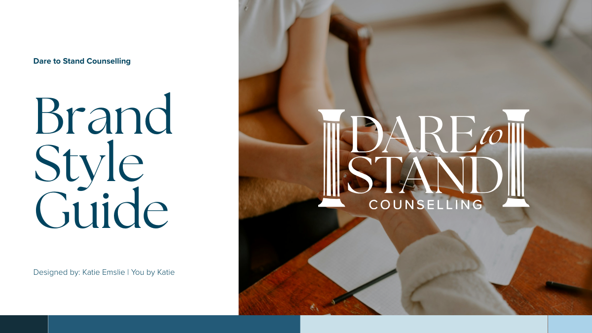
Branding for counsellors brisbaneDare to Stand Counselling Branding
Dare to Stand Counselling helps women navigate some of life's hardest moments. The brand needed to reflect that, professional and established enough to build trust, calm enough to feel safe, and grounded enough to communicate genuine expertise. The brief was traditional but not stuffy.
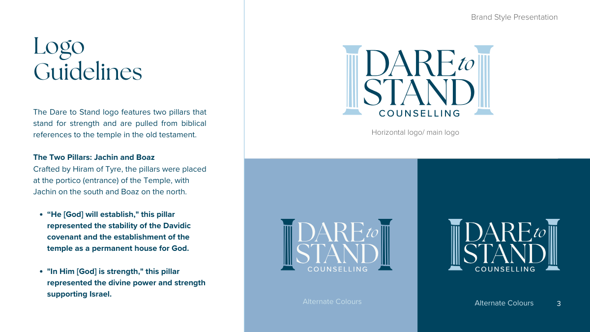
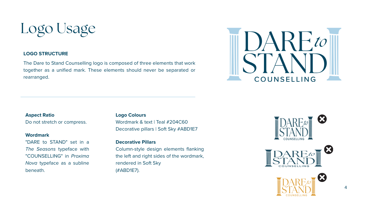
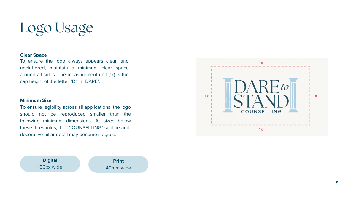
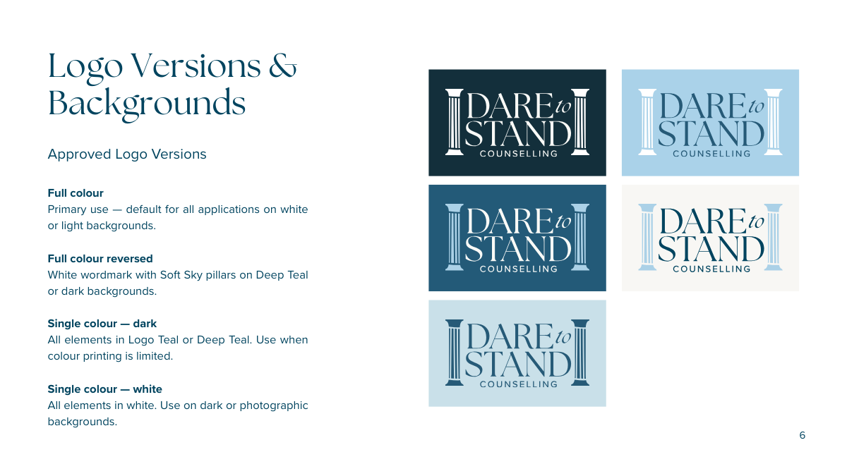
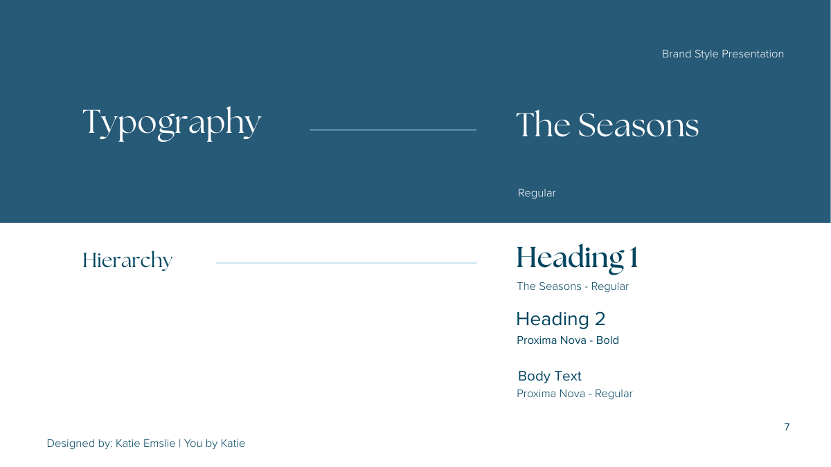
The LogoThe logo centres on two architectural pillars, drawn from biblical references. These were a ‘must have’. Symbols of strength, stability, and divine support. Paired with The Seasons typeface for headings and Proxima Nova for body text, the result is a mark that feels both classical and considered.
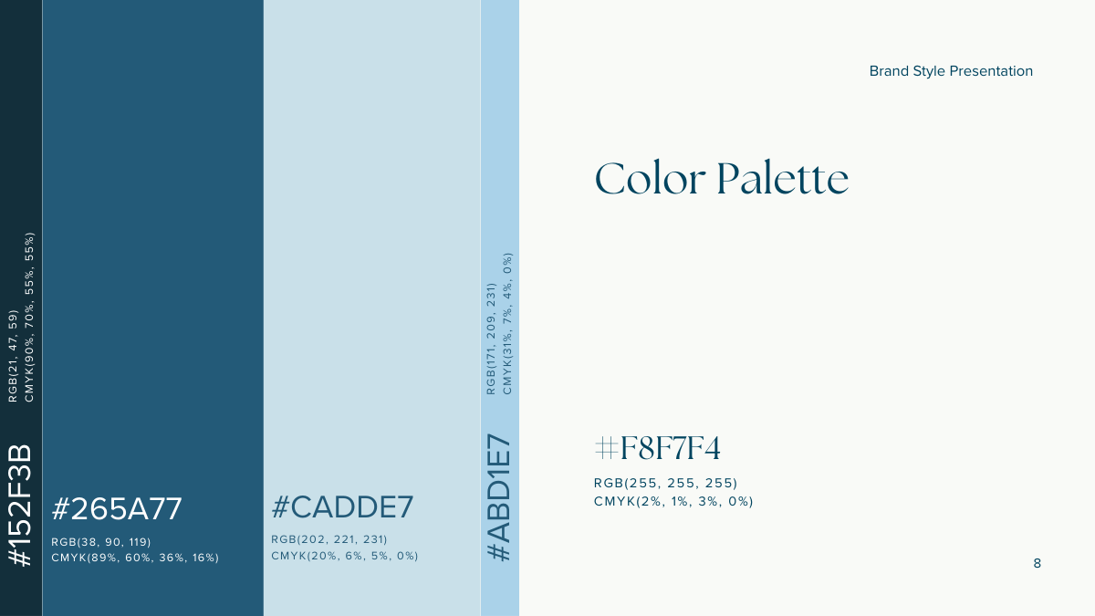
ColoursThe colour palette is anchored in deep teal and soft sky blues, calm, clear, and quietly confident. Colours that work equally well in print and digital. They are traditional yet warm.
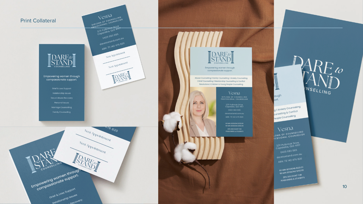
Print CollateralBusiness cards, appointment cards, and a service flyer were designed to carry the brand seamlessly into the physical world. Everything built to feel cohesive whether a client picked up a card at reception or landed on the website.
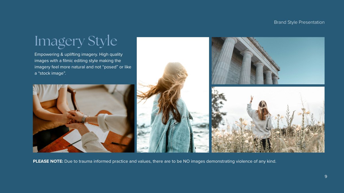
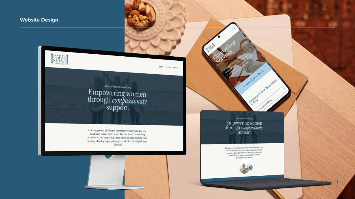
Website DesignThe Squarespace website carries the brand through with the same calm authority. Clean layout, strong typography, empowering imagery. Designed to help women quickly understand what Dare to Stand Counselling offers and feel confident reaching out.