
Spring Forth Co Brand Idenity Design
Megan, founder of Spring For Co, reached out wanting to set her branding up for a long time to come! She had a clear understanding of her target demographic and the overall look and feel she wanted to go for! We spent extra time in the creative strategy phase to get things set up before we delved into the design portion of our project.
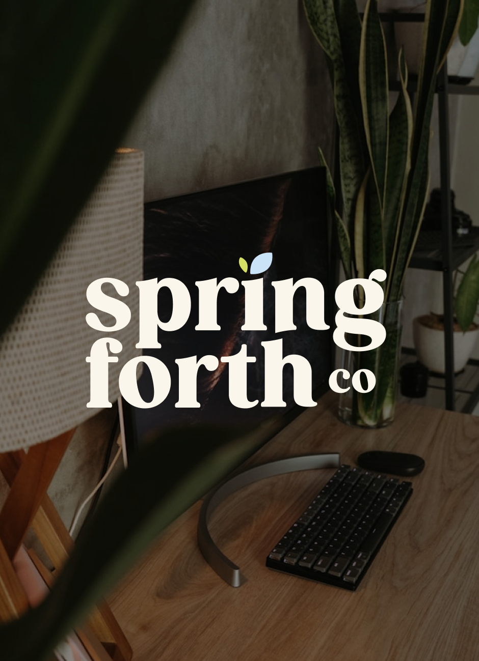
FULL LOGO SUITEThe main logo typeface is strong, confident, and bold yet has a softness that reflects grounded support. The budding leaf represents new life and budding potential, reflecting how businesses will feel when supported by Spring Fort Co.
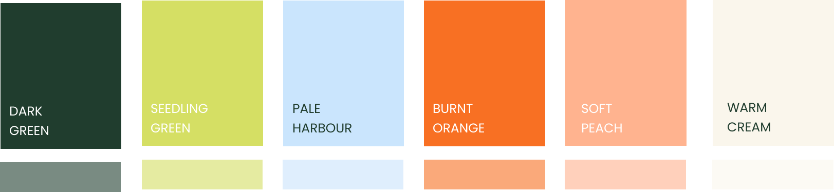
COLOUR PALETTEFresh spring with a warm base! The goal was to make this colour palette feel warm, approachable and refreshing. The soft blue accent against the warmer tones really helped us achieve this balance.
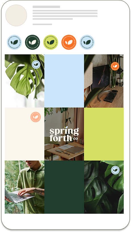
Brand STampsImagery Guide + IMAGE BANKI have LOVED creating little accent icons (or what I have affectionately named brand stamps) for brands lately. They are so versatile and are a great way to add elements of brand recognition across printed and digital collateral.
I am convinced that brand imagery is the secret sauce to many brands, and unfortunately, they get missed way too often. An image speaks volumes without saying a thing, and getting them right is just as important for your brand as the other design elements!

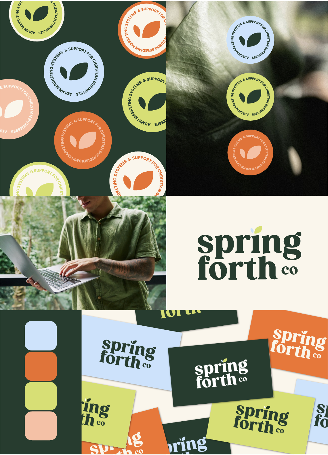
Logo Suite
Main Logo, Logo Alternate & Brand Seals!


Colour Palette
Warm, fresh, approachable and a bit punchy!
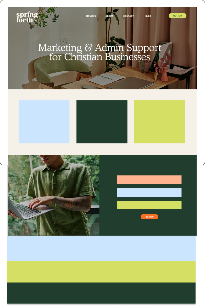
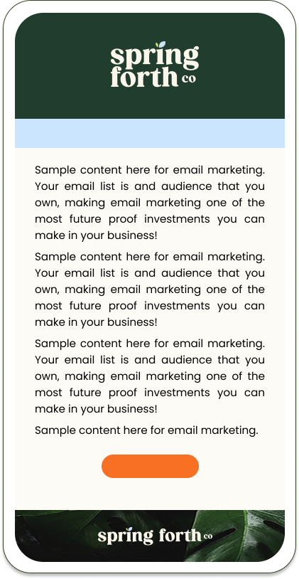
Colour Palette Application Examples
Examples provided of how to use the colour palette across social media, website, and email marketing. Super helpful when you’re just starting a blank screen and a colour palette!
Typography selection & usage examplesIMAGERY STYLE GUIDE + IMAGE BANK